Experience our new Lafayette showroom — Now Open! Come Visit Us -->
10 Transformative Living Room Color Scheme Ideas from Lucas Furniture & Mattress: Your Lafayette Furniture Store

The right color palette can completely transform your living room, turning it from a simple space into a reflection of your personality and a hub of comfort. But pairing colors with the perfect furniture can feel overwhelming, especially when trying to create a cohesive look. That's where Lucas Furniture & Mattress, the trusted furniture store near Lafayette, IN, comes in. We understand that creating your ideal home is about more than just individual pieces; it’s about bringing a complete vision to life with options like custom order sectionals and reliable in-home delivery.
While our expansive 35,000 sq ft showroom is located in nearby Kokomo, we are deeply committed to serving the Lafayette and Central Indiana community with reliable in-home delivery and unparalleled value. This guide will explore 10 inspiring living room color scheme ideas designed to spark your creativity. We'll show you how Lucas Furniture serving Lafayette can help you achieve any aesthetic with our vast selection, from custom order sectionals to incredible clearance deals on mattresses, living room sets, and more. As you envision your new living room, a critical decision will be selecting the best fabric for your sofa, as this central piece heavily influences the overall color scheme.
We will break down each palette with practical advice on choosing paint, furniture, and decor. Whether you’re drawn to warm earth tones, moody jewel tones, or a classic monochromatic look, we’ll provide the actionable insights you need. Let’s dive into these concepts and discover how easy it is to create a stunning living room with the right inspiration and the perfect furniture partner.
1. The Timeless Embrace: Warm Neutrals with Strategic Accent Colors
This foundational living room color scheme idea is a favorite among designers like Nate Berkus and shows like 'Fixer Upper' for a reason: it's endlessly adaptable, cozy, and sophisticated. The approach centers on building a room around warm neutral base colors such as beige, taupe, cream, or a soft warm gray. These tones create an inviting, serene atmosphere that feels both classic and current. The magic happens when you introduce strategic, personality-filled accent colors like terracotta, burnt orange, or a rich mustard gold.
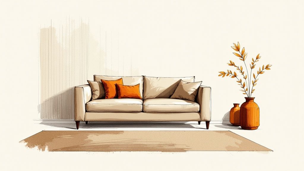
This method provides a stable backdrop for larger investment pieces, like a classic sectional from a Lafayette furniture store you can trust, allowing you to easily swap out smaller decor items with the seasons. It’s perfect for creating a living space that feels curated yet comfortable, offering a high-end look without feeling sterile. For more insights on building your color story from the ground up, you can explore this expert's guide to the perfect color palette.
How to Implement This Scheme:
- Follow the 60-30-10 Rule: Dedicate 60% of your room to your primary warm neutral (walls, large rugs), 30% to a secondary color (a large sectional or accent chairs), and 10% to your boldest accent color (throw pillows, art, decor).
- Layer Textures: To prevent neutrals from feeling flat, incorporate a variety of textures. Think of a nubby bouclé chair, a smooth leather ottoman, a chunky knit throw, and a plush high-pile rug, all in varying neutral shades.
- Choose Meaningful Accents: Select accent colors that complement existing artwork, heirlooms, or personal items you love. This ensures the color palette feels authentic to you.
- Test Your Paints: Always test paint samples on your walls and observe them at different times of the day. Natural and artificial light can dramatically alter how a warm neutral appears in your space.
2. Moody Dark Colors (Deep Jewel Tones)
For a dramatic and enveloping feel, this living room color scheme idea embraces deep, saturated jewel tones and moody hues. Popularized by designers like Kelly Wearstler and featured in publications like Architectural Digest, this approach uses colors like emerald green, sapphire blue, deep purple, and charcoal to create an intimate, luxurious, and sophisticated atmosphere. This modern palette wraps a room in rich color, making it feel cozy and curated rather than dark and small, especially when executed with a clear strategy.
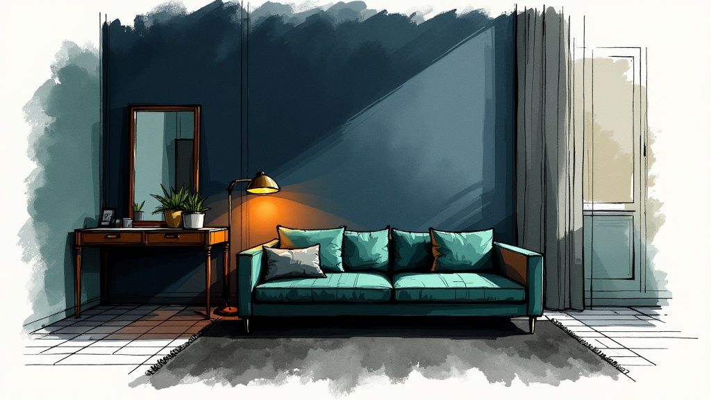
This bold choice is perfect for those looking to make a statement and create a cozy retreat. The key is to balance the dark walls or large furniture pieces with reflective surfaces and strategic lighting to maintain a sense of space and dimension. A plush, custom order velvet sectional from a Lafayette furniture store like Lucas Furniture can become the stunning centerpiece in a room painted with these deep tones. You can further explore how different colors affect a room's ambiance and learn how to set the right mood with color on our blog.
How to Implement This Scheme:
- Balance with Light Elements: Paint the ceiling a crisp white or a much lighter version of the wall color to create an illusion of height. Incorporate lighter-colored furnishings, such as a cream area rug or light gray accent chairs, to provide visual relief.
- Layer Your Lighting: A successful moody room relies on multiple light sources. Use a combination of ambient overhead lighting, task lighting (like reading lamps), and accent lighting to highlight art, architectural details, and create glowing pools of warmth.
- Incorporate Reflective Surfaces: Use mirrors, metallic decor (brass, gold, chrome), and glass tabletops to bounce light around the room. This prevents the dark colors from absorbing all the light and making the space feel closed-in.
- Embrace Rich Textures: Enhance the luxurious feel of jewel tones by layering different textures. Think of a deep navy velvet sofa, silk or satin pillows, a faux fur throw, and dark wood furniture to add depth and tactile interest.
3. The Breezy Escape: Coastal or Nautical Palette
Inspired by the serene beauty of the beach and ocean, this living room color scheme idea brings a relaxed, airy atmosphere into your home. Popularized by designers like Suzanne Kasler and seen in Coastal Living magazine, this palette centers on a crisp, clean base of whites and sandy beiges, accented with various shades of blue and green. The goal is to evoke the peaceful, breezy feeling of a seaside retreat, making it an ideal choice for creating a tranquil space to unwind.
This approach is perfect for making a room feel larger, brighter, and more open. The light and soothing colors reflect natural light beautifully, creating an environment that feels both refreshing and calm. It’s a timeless look that pairs exceptionally well with natural textures, making it easy to create a sophisticated yet comfortable living area. For a deeper dive into this aesthetic, you can explore the full coastal design style and its core elements.
How to Implement This Scheme:
- Build on a Light Foundation: Start with walls painted in a soft white, light cream, or a very pale sandy beige. This creates a bright canvas that allows your blue and green accents to pop without overwhelming the space.
- Layer Blues and Greens: Don't stick to just one shade. Mix various tones like navy, seafoam green, sky blue, and aqua for depth and visual interest. A navy blue sectional can serve as a stunning anchor piece, while lighter blue pillows and seafoam green throws add layers of color.
- Incorporate Natural Textures: This is key to an authentic coastal look. Integrate materials like jute or sisal rugs, rattan or wicker accent chairs, linen curtains, and weathered wood coffee tables. These elements add warmth and prevent the palette from feeling cold.
- Select Thematic Decor Wisely: Choose accents that hint at the coast rather than being overly literal. Think of subtle seascape art, decorative coral pieces, glass vases filled with sand, or lamps with a driftwood base. These thoughtful touches complete the serene, beach-inspired vibe.
4. The Sophisticated Depth: Monochromatic Harmony
A monochromatic living room color scheme idea is the epitome of sophisticated, intentional design. Popularized by minimalist and Scandinavian aesthetics, this approach uses varying shades, tints, and tones of a single core color, such as gray, blue, or even a daring black. The result is a visually cohesive and serene space that feels incredibly unified and calm. Far from being boring, a monochromatic palette creates depth and drama by focusing on the subtle interplay of light and shadow across different intensities of the same hue.
This scheme provides a powerful, gallery-like foundation that makes architectural details and textural elements the true stars of the show. It’s an excellent choice for creating a high-end, hotel-inspired look that feels both restful and curated. Imagine a deep charcoal sectional from Lucas Furniture & Mattress against a soft dove-gray wall, accented with slate-colored pillows and a metallic silver lamp. The focus shifts to form, texture, and the quality of your furnishings, creating a living room that is both bold and understated.
How to Implement This Scheme:
- Embrace the Spectrum: Select one base color and build your palette with at least 3-5 variations. For a blue scheme, this could include navy, cerulean, sky blue, and a barely-there icy blue.
- Texture is Everything: A monochromatic room demands a rich variety of textures to avoid feeling flat. Combine smooth surfaces like a metal coffee table with rougher ones like a linen accent chair, a chunky knit throw, and a high-pile rug.
- Vary Your Materials: Introduce different materials within your color family. Think of a charcoal velvet sofa, a gray-washed wooden console, matte black metal accents, and sheer gray curtains to add layers of interest.
- Master Your Lighting: Use lighting to highlight the subtle differences in your shades. A spotlight can draw attention to the texture of a dark accent wall, while ambient lamplight can create a soft glow on lighter-colored furniture.
5. Warm Earth Tones (Terracotta, Ochre, Rust)
Inspired by the raw beauty of natural landscapes, this living room color scheme idea uses warm, grounding earth tones to create a nurturing and organic atmosphere. Drawing from colors like terracotta, rust, ochre, burnt sienna, and rich warm browns, this palette connects your indoor space to the outdoors, promoting a sense of comfort, stability, and calm. Popularized by the Bohemian design movement and designers like Justina Blakeney, these shades are perfect for crafting a cozy, inviting, and soulful living area.
This approach is exceptionally versatile, fitting seamlessly into Southwestern, Mediterranean, and eclectic interior designs. It creates a space that feels both worldly and deeply personal, wrapping you in warmth the moment you walk in. The key is to balance these powerful, saturated colors with neutral backdrops and plenty of natural textures, allowing the earthy hues to truly shine without overwhelming the room.
How to Implement This Scheme:
- Use as a Feature: Instead of painting all four walls, use a bold terracotta or rust as an accent wall behind your main seating area. This creates a stunning focal point and adds depth without making the space feel smaller or too dark.
- Balance with Neutrals: Pair these vibrant earth tones with soft, neutral walls in shades of cream, beige, or a very light greige. This provides a clean canvas that makes the warmer colors pop.
- Layer Natural Textures: This palette thrives when combined with natural materials. Think of a rich leather sofa, a jute or sisal rug, rattan furniture, clay pottery, and linen curtains. These elements enhance the organic, grounded feel of the color scheme.
- Incorporate Greenery: Live plants are a perfect complement to warm earth tones. The vibrant green of houseplants provides a beautiful, natural contrast that breathes life and freshness into the space, reinforcing the connection to nature.
6. Soft Pastels with Neutral Base
This gentle, contemporary palette has become a staple in modern design, popularized by Scandinavian-inspired aesthetics and a desire for serene, light-filled spaces. The concept centers on a clean, neutral foundation of crisp white, light gray, or soft cream. This airy backdrop allows soft pastel accents like pale pink, mint green, soft lavender, or baby blue to truly shine without overwhelming the room, creating a living space that feels both calming and sophisticated.
This color scheme is perfect for making smaller living rooms feel larger and brighter. The combination of soft hues and a neutral base creates an open, uncluttered look that is both modern and inviting. It provides a subtle way to introduce color, making it an excellent choice for those who want to move beyond all-neutral decor but aren't ready for bold, saturated shades. For more ideas on introducing color without major commitments, you can explore how to add color to your home without painting.
How to Implement This Scheme:
- Start with a Neutral Canvas: Paint your walls in a versatile shade of white or a very light gray. This creates the perfect blank slate for your pastel furniture and decor to pop.
- Layer Pastel Hues: Don't limit yourself to just one pastel. A soft blush armchair, mint green throw pillows, and art with hints of baby blue can coexist beautifully. The key is to keep the tones muted and cohesive.
- Incorporate Natural Textures: Ground the ethereal feel of pastels by incorporating natural wood tones and textures. A light oak coffee table, a rattan accent chair, or a jute rug adds warmth and prevents the space from feeling too sterile.
- Use Geometric Patterns: To add modern visual interest, introduce geometric patterns through area rugs, cushions, or artwork. This adds a structured, contemporary edge that balances the softness of the pastel colors.
7. Bold, Saturated Color Blocking
For the truly adventurous and artistic, this living room color scheme idea moves beyond a single accent wall into the realm of dynamic, personality-filled design. Bold, saturated color blocking is an energetic approach that uses distinct blocks of vibrant color, such as a deep ruby red wall next to a section painted in mustard yellow. This contemporary style, with roots in the Memphis design movement, celebrates color confidence and transforms your living room into a conversation-starting masterpiece.
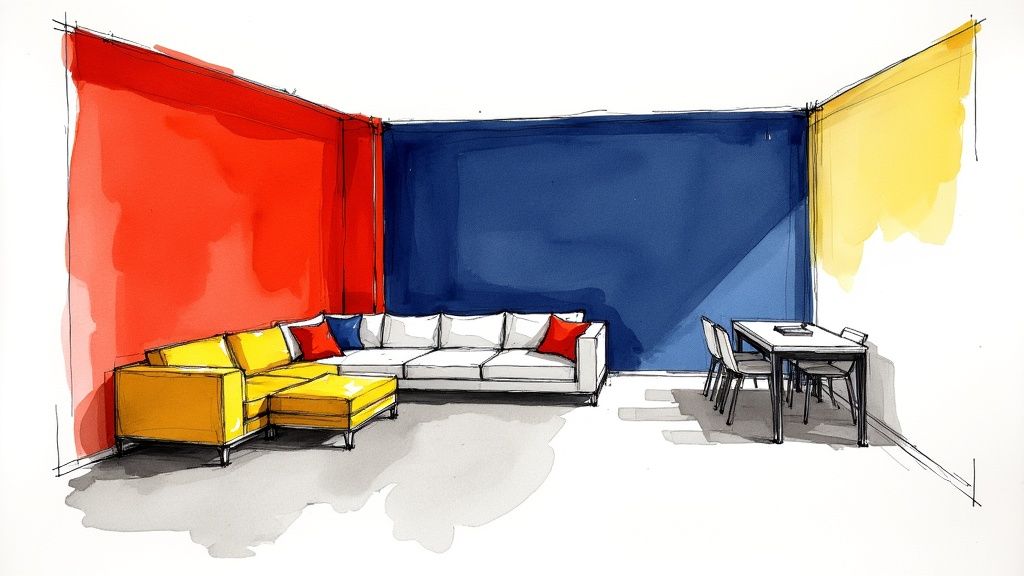
This method is perfect for homeowners who see their walls as a canvas for self-expression. It creates a high-impact, memorable space that feels both modern and playful. The key is to commit to fully saturated hues and use them to define different zones or architectural features within the room. A bold approach like this provides an incredible backdrop for minimalist, solid-colored furniture, allowing each piece to stand out. For those starting this journey, you can explore how to create a perfectly balanced accent wall before committing to multiple blocks.
How to Implement This Scheme:
- Balance with Neutrals: To prevent visual overstimulation, ensure there are "breathing spaces" of white, black, or soft gray. This could be the ceiling, trim, floor, or a large neutral area rug.
- Use Color Theory: Select colors that are either complementary (opposite on the color wheel, like blue and orange) for high contrast, or analogous (next to each other, like blue and green) for a more harmonious yet still bold look.
- Keep Furniture Simple: Opt for furniture with clean lines and solid, neutral fabrics. A sleek gray sectional or a simple white armchair will ground the space and let the walls be the star.
- Lighting is Crucial: Ensure your living room is well-lit with both natural and artificial light. Proper lighting makes saturated colors appear rich and intentional, rather than dark and overwhelming.
8. Sage Green and Soft Gray Palette
This contemporary, nature-inspired combination brings the calming essence of the outdoors into your living room. The scheme centers on a soft, muted sage green paired with cool-toned grays and crisp whites, creating a space that feels both modern and organically connected to nature. Popularized by modern farmhouse influencers and seen across design-forward Pinterest boards, this palette offers a sophisticated yet serene backdrop for daily life. It’s an ideal choice for creating a tranquil retreat that remains stylish and relevant.
The beauty of this living room color scheme idea lies in its versatility. A soft gray sectional serves as a perfect neutral anchor, allowing the gentle sage tones on the walls or in accent decor to stand out without overwhelming the space. For those considering a neutral or soft gray base, delving into guides that explore what colors pair well with a grey couch can provide excellent ideas for accents and complementary hues. This palette works exceptionally well in rooms with ample natural light, enhancing the airy, botanical feel.
How to Implement This Scheme:
- Balance Cool and Warm Tones: While sage and gray are inherently cool, introduce warmth through natural wood finishes on coffee tables, sideboards, or flooring. A light oak or warm walnut creates a beautiful and necessary contrast.
- Incorporate Natural Elements: Reinforce the nature-inspired theme by adding an abundance of houseplants, botanical prints, and natural textures like linen curtains, a jute rug, or woven baskets.
- Use Metallics for a Touch of Glamour: Layer in warm metallic accents to prevent the palette from feeling too muted. Brushed brass or copper light fixtures, picture frames, and decorative objects add a touch of warmth and sophistication.
- Layer Shades of Green: Don’t stick to just one shade of sage. Introduce deeper forest greens or lighter minty tones through throw pillows, blankets, and artwork to create depth and visual interest.
9. Warm White with Warm Wood Tones
This classic and enduring living room color scheme idea creates spaces that feel both comforting and sophisticated. It revolves around a foundational palette of warm whites and creams, which are then richly layered with the natural beauty of warm wood tones like honey, amber, and golden oak. This approach is beloved in traditional, farmhouse, and transitional designs because it feels welcoming, ages gracefully, and provides a serene, light-filled backdrop for everyday life.
This combination creates a space that feels inherently comfortable and grounded. It’s an approachable palette that allows architectural details and the quality of your furniture to shine. A beautifully crafted wooden coffee table or a classic console from a trusted Lafayette furniture store becomes a focal point against the soft, warm white walls, creating a look that is both curated and livable. The result is a welcoming atmosphere that is perfect for relaxing and entertaining.
How to Implement This Scheme:
- Choose the Right White: Opt for white paints with warm, creamy, or slightly yellow undertones. Avoid stark, cool whites with blue or gray undertones, as they can feel sterile. Test samples like Benjamin Moore's White Dove or Sherwin-Williams' Alabaster.
- Vary Wood Tones: Don't feel obligated to match all your wood furniture. Layering different warm wood tones, such as a medium oak floor, a honey-toned media console, and darker walnut accents, adds depth and visual interest.
- Introduce Warm Textiles: Enhance the cozy feeling by incorporating textiles in warm, earthy colors. Think of linen curtains in a natural flax color, a plush wool rug in a soft beige, and throw pillows in muted terracotta or olive green.
- Layer Your Lighting: Use a combination of ambient, task, and accent lighting to enhance the warmth of the room. A central fixture with a warm-toned shade, paired with table lamps and floor lamps, will create a soft, inviting glow in the evenings.
10. Luxe Black, Gold, and Cream Palette
For those looking to make a bold, glamorous statement, this opulent living room color scheme idea delivers pure drama and sophistication. Inspired by high-end boutique hotels and the work of luxury designers like Peter Marino, this palette combines the depth of black, the warmth of cream or ivory, and the radiant shimmer of gold or brass. The result is a high-contrast, visually stunning space that feels curated, luxurious, and undeniably chic. It’s a design choice that signals confidence and a taste for the finer things.
This approach transforms a living room into a destination, creating an atmosphere perfect for entertaining or simply enjoying an elevated daily experience. The key is balance: black provides a powerful, grounding anchor, cream softens the look and prevents it from feeling too heavy, while gold accents inject life and a layer of shimmering luxury. This combination works exceptionally well in spaces with good natural light, where the interplay between dark, light, and metallic can truly shine.
How to Implement This Scheme:
- Use Black Strategically: You don't need to paint the whole room black. Instead, use it for a high-impact accent wall, on elegant trim and molding, or through a major furniture piece like a sleek media console or a sophisticated black leather sectional from Lucas Furniture & Mattress.
- Layer Gold and Brass: Incorporate metallic elements throughout the space. Think of a statement chandelier, the legs on a coffee table, picture frames, and decorative objects. Mixing polished and brushed finishes adds depth.
- Balance with Cream Textiles: Soften the dramatic contrast with plush textiles in cream, ivory, or off-white. Consider a large, soft area rug, luxurious velvet curtains, or an abundance of throw pillows on your sofa to add comfort and light.
- Warm, Dimmable Lighting is Key: This palette thrives under warm, layered lighting. A central chandelier, floor lamps, and table lamps with dimmers will allow you to control the mood, making the gold accents glow and creating an inviting, intimate ambiance in the evening.
10-Style Living Room Color Scheme Comparison
| Style | Implementation Complexity 🔄 | Resource Requirements ⚡ | Expected Outcomes ⭐ | Ideal Use Cases 📊 | Key Advantages & Tips 💡 |
|---|---|---|---|---|---|
| Warm Neutrals with Accent Colors | Low — simple base with 1–2 accents | Low–Medium — paint, textiles, accessories | Warm, inviting, versatile, timeless | Living rooms, open-plan homes, resale-focused projects | Easy seasonal updates; use 60-30-10 rule; layer textures |
| Moody Dark Colors (Deep Jewel Tones) | Medium–High — needs strategic lighting and balance | Medium — quality paint, metallics, lighting fixtures | Dramatic, intimate, luxurious | Formal living/dining rooms, boutique spaces | Pair with light ceilings, use accent lighting and mirrors |
| Coastal or Nautical Palette | Medium — requires layering light colors/textures | Low–Medium — paints, natural textiles (jute, linen) | Bright, breezy, calming | Beach houses, bedrooms, relaxation areas | Mix blues/greens; add natural materials; keep white base |
| Monochromatic Color Scheme | Low–Medium — depends on texture & shade selection | Low — varied shades of same paint, mixed materials | Cohesive, sophisticated, calming | Minimalist interiors, hotels, any size rooms | Use 3–5 shades, vary textures, add subtle accent pieces |
| Warm Earth Tones (Terracotta, Ochre, Rust) | Medium — balance warmth to avoid heaviness | Medium — rich paints, natural materials, warm lighting | Grounding, cozy, organic | Bohemian, eclectic, Southwestern, Mediterranean styles | Use as accents or one wall; layer natural textures and cool accents |
| Soft Pastels with Neutral Base | Low — straightforward neutral base + pastels | Low — neutral paint, pastel furnishings | Airy, calming, contemporary | Small spaces, nurseries, contemporary homes | Keep walls neutral; mix with warm wood; use geometric patterns |
| Bold, Saturated Color Blocking | High — requires confident planning & precision | Medium–High — multiple paints, careful execution | Energetic, personalized, high-impact | Creative studios, feature rooms, accent walls | Start with one wall; use complementary theory; balance with neutrals |
| Sage Green and Soft Gray Palette | Medium — balance cool tones and lighting | Low–Medium — paint, plants, warm woods | Calming, nature-connected, sophisticated | Modern farmhouse, living rooms, plant-friendly interiors | Pair sage with warm wood and 2700K lighting; add plants |
| Warm White with Warm Wood Tones | Low — classic, straightforward approach | Medium — quality wood furniture, warm paint tones | Timeless, welcoming, flexible | Traditional homes, family spaces, resale properties | Choose warm whites (avoid cool hues); mix wood tones for depth |
| Luxe Black, Gold, and Cream Palette | High — demands high-quality finishes & lighting | High — premium paints, metallics, upscale furnishings | Luxurious, dramatic, high-end | Formal rooms, boutique or hotel-inspired interiors | Use black strategically; ensure warm dimmable lighting; add creams for balance |
Why Choose Lucas Furniture? (Our Value Proposition)
At Lucas Furniture & Mattress, we are more than just a furniture store near Lafayette, IN; we are your locally-owned partner in creating a home you love. We’re committed to the Central Indiana community, offering a unique blend of value, flexibility, and trust that sets us apart. Our Low Price Promise ensures you get the best deal, while our massive clearance center offers savings of up to 70% off. We believe everyone deserves a beautiful home, which is why we offer flexible financing options to make your dream furniture a reality. Backed by outstanding customer reviews, our team is dedicated to providing a five-star experience from the moment you walk into our Kokomo showroom to the day your furniture arrives with our reliable in-home delivery to Lafayette.
Furnish Every Room & Save Big
Your home's style shouldn't stop at the living room. At Lucas Furniture, we have everything you need to create a cohesive look throughout your home. Explore our vast selection of dining room sets, bedroom furniture, home office solutions, and even seasonal outdoor furniture. Our clearance outlet is constantly updated with new deals, giving you access to high-quality pieces at unbeatable prices. Whether you need a new sectional, a dining table for the whole family, or a complete bedroom refresh, you'll find it all under one roof.
Achieve Better Sleep: Your Mattress Options
A great day starts with a great night's sleep. We are also a premier mattress destination, offering a wide range of options to suit every sleep style and budget. From plush pillow tops to firm memory foam, our knowledgeable staff can help you find the perfect mattress for your needs. Explore our Mattress Guide page to learn more before you visit, and discover how the right mattress can transform your well-being.
Customize Your Comfort: Simple Financing & Custom Orders
Your home should be a unique reflection of you. If you can't find exactly what you're looking for on our floor, our custom order program allows you to choose from hundreds of fabrics and configurations to create the perfect sectional, sofa, or chair. Paired with our simple financing options, achieving your custom look is easier and more affordable than ever. We're here to help you build your vision without compromise.
Shop Your Way: Online, In-Store, and Delivered to Lafayette
We make shopping for furniture convenient. Browse our entire inventory online from the comfort of your Lafayette home or visit our 35,000 sq ft showroom in Kokomo for a hands-on experience. No matter how you choose to shop, you can count on our professional in-home delivery service. Our team handles everything with care, ensuring your new furniture arrives safely and is set up exactly where you want it.
Visit our clearance page to see the latest incredible deals. Visit our showroom near Lafayette today, or browse our full inventory online with guaranteed in-home delivery to the Lafayette area